Surrender
December 2025
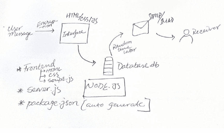
Surrender is a web-based messaging system that strips away every feedback loop of modern communication (read receipts, delivery cofirmation). Users write a message on a textured, letter-like interface. When they hit send, the message folds into an envelope and disappears. It is delivered to the recipient's email after a random delay of one to seven days. The sender doesn'tknows when. There is no way to revisit, edit, or undo. Messages are encrypted in-browser, delivered via Gmail API, and deleted from the server after delivery.
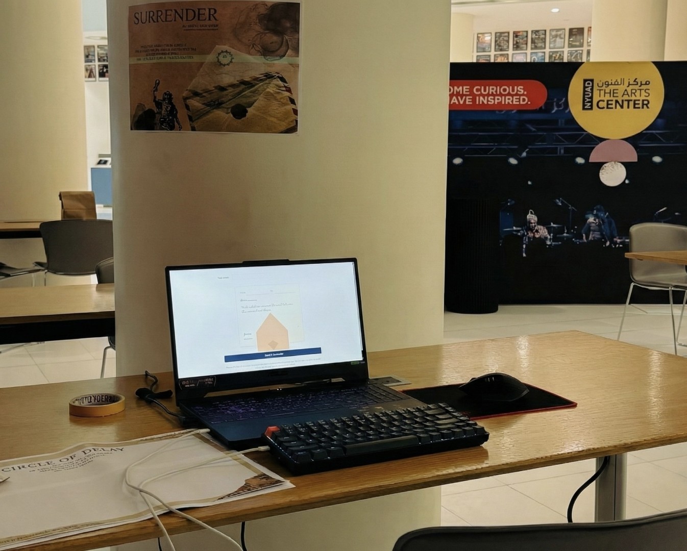
Role: Solo -- Concept, Design, Development
Duration: December 2025
Tools: JavaScript (node, react), Gmail API, Front-end (HTML, CSS
Type: Design research / Behavioral interaction design
THE PROBLEM
Modern messaging systems, aside from moving words faster, reshape how people think about communication. Users' constant entanglement* with the messaging system (read receipts, typing indicators, instant delivery) collapses async communication into single moments and blurs the boundary between sync and async communication. The phenomenon that developed during the time of letters and telegraphs, where people used to consciously invest time in writing to one another and anticipate response for days, even weeks, has been proven to be a new normal, sometimes necessary side* of human communication.
After I observed that people seem to take the instant messaging system rather for granted and expect speed, clarity often gets not shed light upon enough. Which results in the common thought among people that written communication is not as effective as oral. But in the hindsight, in the olden times of letters and telegraphs, that complaint hardly existed. I fell back to research articles and books to solidify my understanding.
WHY IT MATTERS
Sherry Turkle's Alone Together (2011) and Reclaiming Conversation (2015) document what two decades of instant messaging have done to the texture of communication. Her argument: digital messaging gave people control over timing and self-presentation, and that control made communication feel safer while making it shallower at the same time. The systems are engineered to remove the emotional exposure that gives real-time communication weight, like not knowing how someone will respond or not being able to retract what you said
The feedback loops themselves have been studied in isolation. A 2017 study from the Norwegian University of Science and Technology found that read receipts directly produced anxiety, avoidance behavior, and compulsive app-checking, which is the feature that created a monitoring reflex that users hadn't consented to. A CHI 2018 study on mobile messaging stress found that typing indicators placed users in a state of continuous performance pressure, a feeling the researchers described as being permanently "on stage." A 2026 Psychology Today analysis went further: much of texting anxiety, it found, originates not in the content of messages but in the infrastructure around them. The gap between "seen" and "replied" became a source of relational distress with no precedent before the digital age.
My research kept circling back to is an emotional architecture. Which, once in place, makes act of writing reorganizes itself around it. It makes communication faster, more reactive and less considered. The letter era's complaint was rarely that written communication failed to convey meaning. The digital era's is almost always that it does and that is the gap Surrender intends to put under limelight.
PROCESS & ITERATION
The experience is a short narrative sequence: reflection on older communication forms, gentle critique of modern habits, a personal question about waiting, then the letter itself. Each screen intentionally slower than the last.
Core intervention: messages delayed randomly, one to seven days. Once sent, it can't be rolled back. No notifications will be sent to the user about when or even whether the message is delivered. The receiver will get the message in form of an email that will first explain the rationale behind the project, followed by the message that was sent to them.
The interface was made to move away from email patterns toward letter logic. That was implemented by making the writing surface to textured paper and typography to handwriting. Names were embedded in the letter itself. When the message is sent, it folds into an envelope and disappears.
Iterations
Initially in V1, there was just one screen explaining the system, after which the users directly jumped into the letter interface. Advised by the mentor, I implemented the friction points which substantially upscaled the project as that gave the users perfect understanding of what they were engaging in. The Q/A screen along with the slider were interactive elements that made the users immersed in the experience, which played a huge role in the increment of how much time users spent in the screens and how much in actually composing the message.

KEY DECISIONS & TRADE-OFFS
Random Delay:
Users don't know when the message will be sent. That stuck people as unsettling, which is precisely what my goal was with this project.
The Paradox of Control:
Users were made to realise that they had full control of writing the message but that only until they clicked send. After so, the message disappeared in the void. Aimed to mimic the letter-era, click send == post mail, the letter is in the stack of thousand others.
Receiver's end:
The receivers' reactions to the message was logged as a survey form. Most of them were surprised to receive the message. Partly because it was unsolicited, and partly because they felt cared for.
TESTING
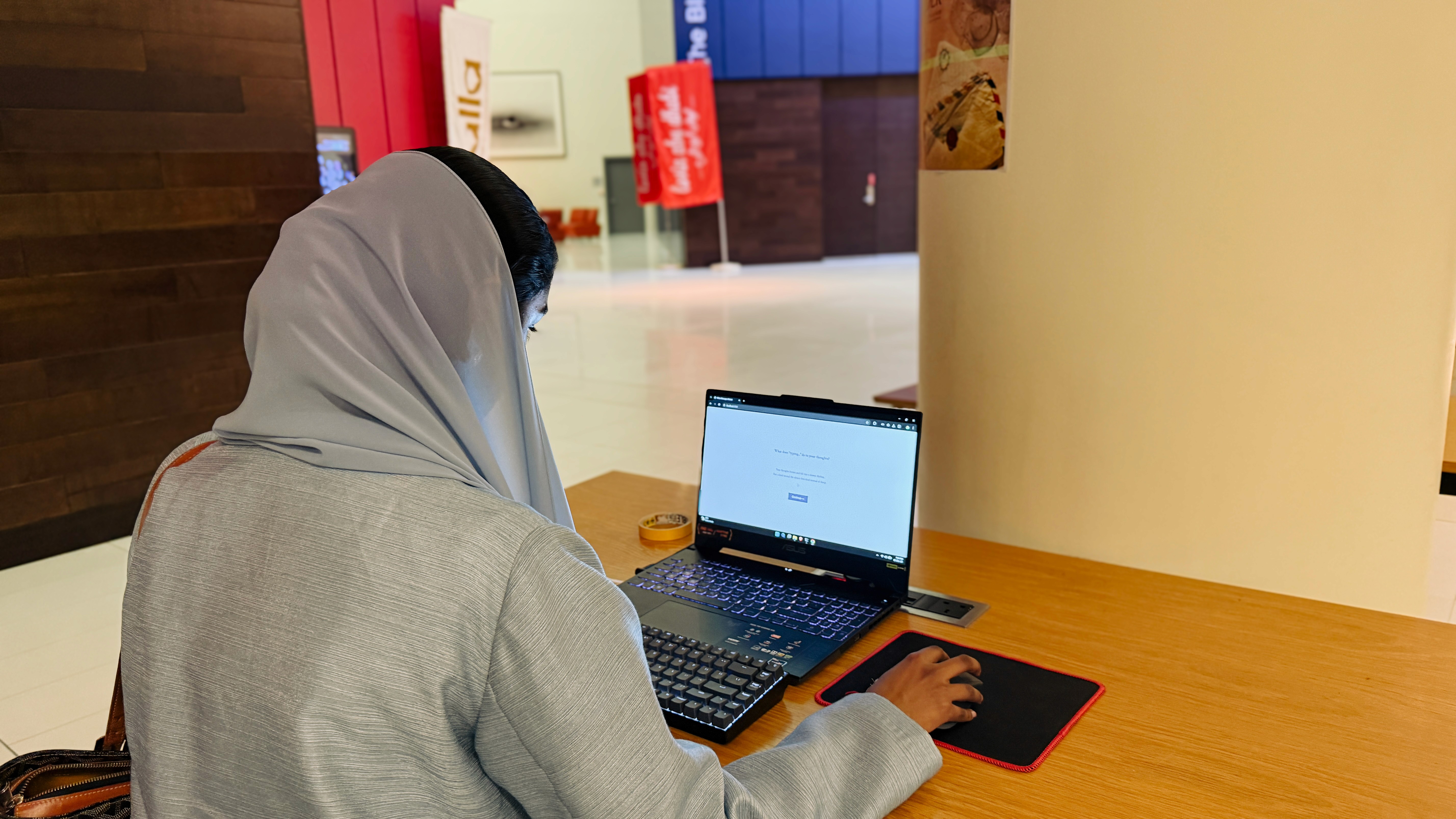
Testing happened through observation during use (I didn't peek at What the user was typing, just how their expressions changed as they did) and informal follow-up conversations over the days and weeks after sending. This wasn't as much a structured usability testing as it was observation of how people's behavior changed in real time and the aftermath of it.
Writing behavior changed immediately. People slowed down. They paused longer between sentences. They chose words more carefully. Language softened; people wrote things they might not say in a text, because the interface told them this was a different kind of communication. Several users commented that the textured paper and handwriting typography made them feel like they were writing something that mattered, which was different from shooting a text.
People sent messages to parents, close friends, and loved ones although I hadn't directed anyone toward a particular recipient. The interface nudged people toward meaningful communication. One user wrote to a parent they hadn't spoken to in days. Another sent a message to a friend going through a hard time in the finals week. When I followed up days later, multiple recipients reported that the messages felt more thoughtful, personal. One recipient described being caught off guard by how much the message meant, specifically because it arrived unexpectedly days later rather than in the middle of a conversation thread.
The waiting period became its own experience. Some senders forgot about the message entirely, then were reminded of it when the recipient responded. Others kept checking their inbox for days, aware that they'd sent something they couldn't take back. Both reactions confirmed the same thing: instant confirmation had trained people to expect control over the communication arc, and removing that control revealed how dependent they'd become on it.
REFLECTION
My goal was not to promote slowness or bring back something obsolete. I wanted to learn how small system choices shape emotional behavior. What happens when a feedback loop is removed and how it changes how carefully wrote, how they monitored silence, how they experienced sending. My core design materials were uncertainty and friction; both of them proved to be huge impact-points in written communication.
The key lesson for me was that conceptual clarity is not always enough. V1 did fine when the questions was whether it could be understood. With some increased friction strategically placed and some UI modifications, V2 made users Feel the project. That gap between comprehension and immersion is where I will invest more time in for my upcoming work.
CITATIONS
Turkle, S. (2011). Alone Together. Basic Books.
Turkle, S. (2015). Reclaiming Conversation. Penguin Press.
Grønli, T.-M., Johannessen, T. V., & Bygstad, B. (2017). Exploring the impact of 'read receipts' in mobile instant messaging. Norsk Informatikkonferanse (NIK), 5(1).
Shin, D., Yoon, H., & Choi, B. (2018). Understanding stress on mobile instant messengers based on user behaviors and design features. Proceedings of the 2018 CHI Conference on Human Factors in Computing Systems (Paper No. 312). ACM.
Boateng, A. (2026). Texting anxiety and the monitoring infrastructure of modern communication. Psychology Today.